ASSETS
GUIDELINES
It is crucial in our company identity to use our company and product logos accurately and consistently. In this section you will find usage, spacing, and color guidelines.
Our logos are available in the following color systems: CMYK, RGB, PMS. And the following formats: EPS, PNG, SVG.
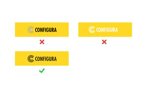
Always respect the clear space around our logos. Don’t place anything within.
For more information on how to interact and use the Configura brand and related products, see Brand Guidelines for Customers and Partners (pdf).
-
Is the communication directed toward employees, recruitment, legal document, or trade show?
If yes, use the company logo.
-
Is the communication directed toward end-users (academy, education program, support)?
If yes, use a CET software logo.
-
Is the communication directed towards a certain industry?
If yes, use a CET Commercial Interiors, CET Kitchen & Bath, or CET Material Handling logo.
If not, use the black or white generic CET software logo.
LOGOTYPES
COMPANY
Configura’s company logo symbolizes stability and long-term partnership. The logo consists of a symbol and wordmark that together create a whole logo. The symbol can never be used separately from the wordmark.
The company logo exists in three versions: main logo, black and white/negative.
PRODUCTS
The product logos exists in three versions: main logo, black and white/negative.
BRAND CRIMES
- Don’t use unapproved color combinations
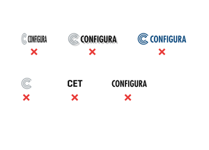
- Don’t use a drop shadow
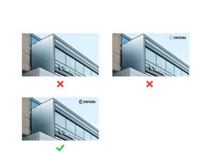
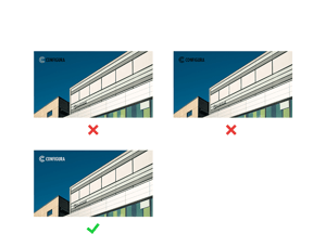
- Don’t use the logo on top of complex images
- Don’t crop the logo
- Don’t use the logo in text
- Don’t distort the logo
